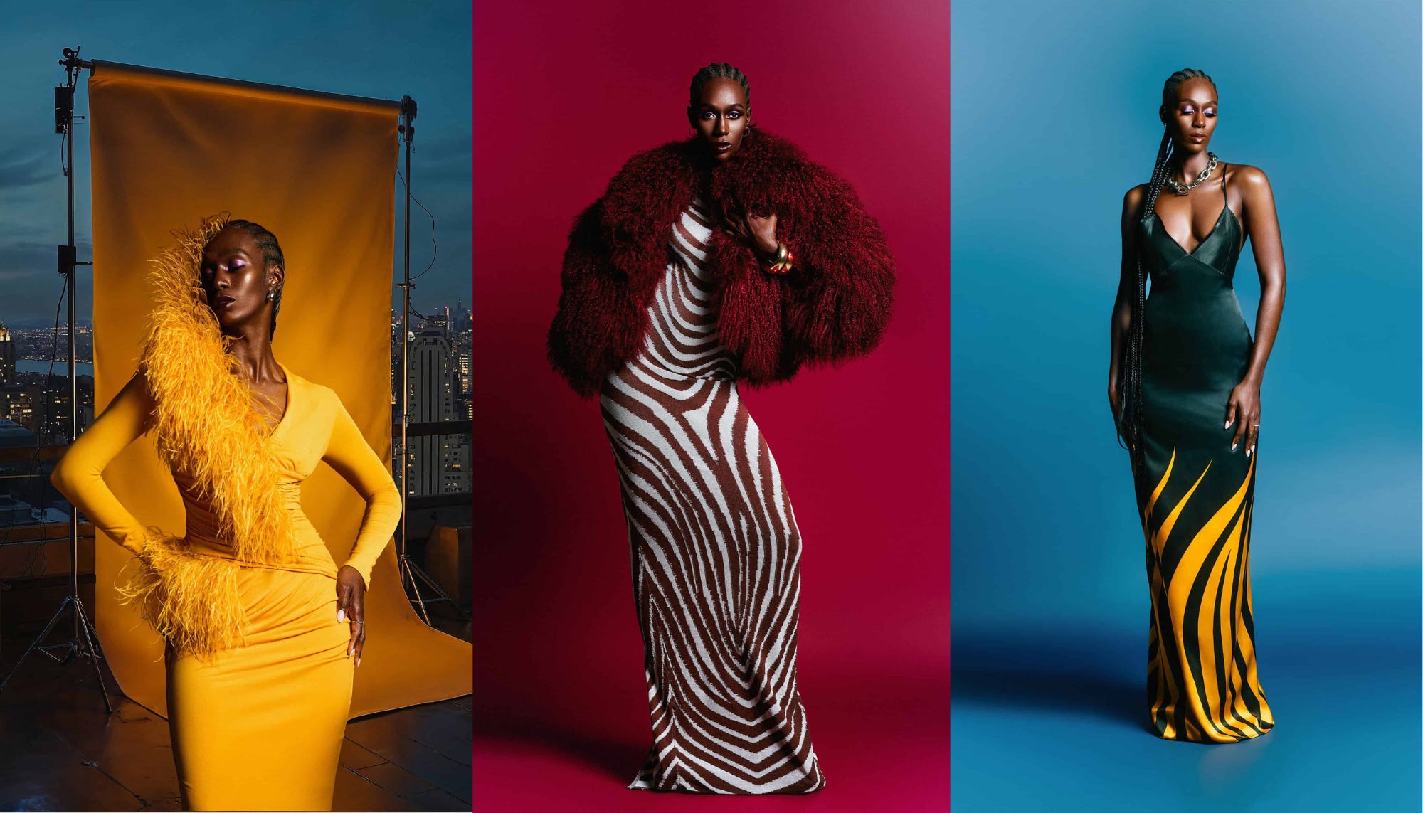
Unpacking the fashion campaigns that caught our eye, whether for their creativity, cultural impact, or smart strategic thinking.

Some campaigns go loud with styling. Others lean on celebrity. But Hanifa? Hanifa builds its story through color, and that’s what makes it unforgettable.
Founded by designer Anifa Mvuemba, Hanifa is a Black-owned high-end label that’s become known for its bold silhouettes, fluid fabrics, and fearless use of color. Since its founding in 2011, the brand has built an identity rooted in movement, vibrancy, and emotional resonance, especially for Black women, who have long been left out of the luxury fashion conversation.
From the beginning, Anifa has used color not just to style, but to express. They celebrate Black beauty, curves, and femininity in a way that’s visually rich, culturally intentional, and joyfully bold. Joy, power, freedom, femininity…it’s all in the palette. When you look at a Hanifa campaign, you don’t just see a garment, you feel a mood. Whether it’s a saturated fuchsia gown or a lime green set in motion, Hanifa uses color as a creative and strategic tool.
One of Hanifa’s most visually iconic drops is the Pink Label Congo collection. The bold, saturated palette full of shades of red, blue, and yellow, was inspired by Anifa’s Congolese heritage. Shot on dark skin tones and styled against textured, minimal backdrops, the collection showed us how to let color and composition speak for themselves.
Hanifa’s Live Out Loud collection is designed not just to wear, but to feel. The color stories here—acid greens, deep lilacs, and vibrant citrus shades—felt alive. The campaign was filled with movement: dresses caught midair, models mid-step, fabric trailing behind them in cinematic waves. There were no overworked concepts, just light, motion, and color doing what it does best: evoking joy.
From a campaign strategy perspective, Hanifa’s approach is extremely effective. Here’s why:
The brand has developed a clear visual identity that doesn’t rely on logos or slogans…just bold, consistent imagery.
Color serves as a brand marker. It stops the scroll and holds attention.
The campaigns feel personal and intentional, inviting the audience to feel instead of just look.
Across every channel, from Instagram to e-commerce to press shots, Hanifa’s aesthetic remains consistent, reinforcing brand recognition at every touchpoint.
And importantly, Hanifa shows us that representation and emotion are not side notes, they are strategy.
You know a Hanifa campaign when you see it. That kind of clarity is rare and valuable.

Media Takeaway:
Color is more than styling. It’s storytelling. Hanifa proves that campaigns don’t have to be complicated to be memorable. By leaning into color as a primary design and media tool, the brand turns simplicity into strength. Emotional resonance, cultural specificity, and visual consistency all come together in a way that makes the brand unmistakable.
Color is the story, not just the background. And Hanifa tells it beautifully.
What brands do you think use color not just as aesthetic, but as strategy?
connect with us: IG → pinterest → twitter


